Research
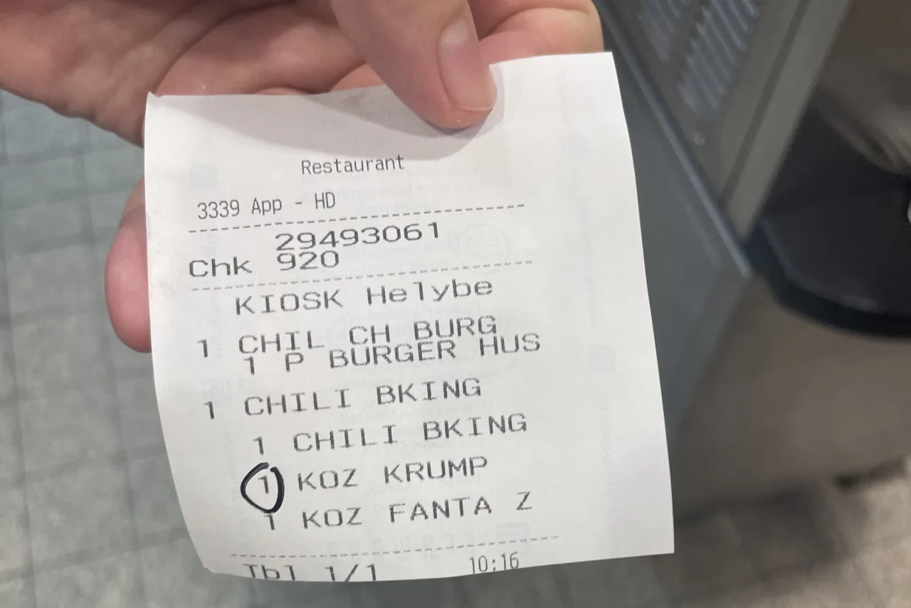
After writing the research plan, I started with in-depth interviews with decision-makers to understand the features, pain points and needs related to the POS software. It was just as important to understand the day-to-day difficulties from the users’ side, so I sat down with staff in different roles to talk and to map exactly how they use the interface. To see the whole operation in practice, my colleagues and I ran field research in several Budapest restaurants at different times of day, including peak hours.
Challenges
One of the biggest challenges was making the new system fit existing workflows, so that experienced staff could switch to it smoothly. The software also had to support different restaurant types (shopping mall, city center and drive-thru) while making order taking faster. The growing role of digital channels (self-service kiosks, mobile apps and delivery) added further complexity, and these had to be integrated without friction.
Solutions
Based on the research findings, we developed several recommendations to make the system clearer and easier to use. We grouped these into three areas and validated the key flows with a prototype:
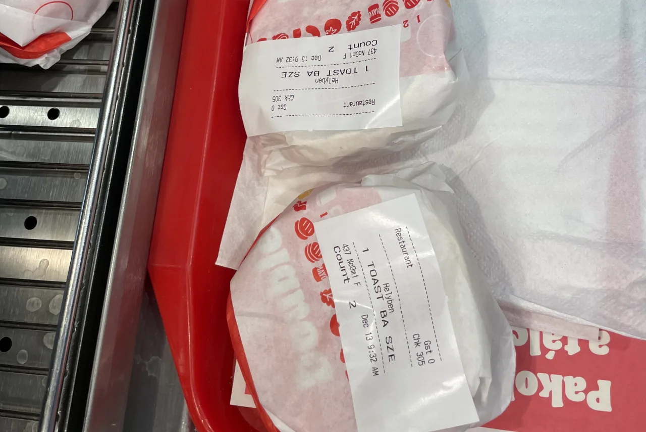
- Clarity: consistent navigation and an intuitive visual interface that is easy to memorize, supported by unified product categories and one consistent rule for abbreviating product names.
- Ordering flow: the steps on screen follow the real order of work behind the counter.
- UI: a structured system of visual elements (color codes, icons), a clear visual distinction for online orders, and unambiguous status indicators.
Results
The client accepted our recommendations, and they became the basis of the development plan for the new POS system. The unified product categories and naming rules are now in use. We documented the different needs of the three restaurant types (shopping mall, city center and drive-thru) and handed them over to the development team.
Takeaways
Field research revealed workarounds and blockers that we couldn’t have picked up from the interviews. It was the missing piece we needed to see how the system really works.
Experienced staff work from muscle memory, so even moving a button on the POS interface can slow them down. Wherever we could, we kept the familiar layout and only made changes where the research showed a real problem. Putting product names into a clear system also gave new staff an easy-to-learn logic, which made their onboarding smoother.