Skip to content

Senior Product Designer working across discovery, product design, and complex digital products, with a focus on solving the right problems first

I’m Mózer Krisztián, a senior product designer with 15+ years of experience in mobile apps, media, e-commerce, finance and public services.

I’ve designed mobile products and responsive websites, worked on brand redesigns, and helped agile teams build design into the way they work.

Today I focus on design discovery: I plan and run the research, turn findings into clear problem statements, and stay with the team from the first interview to launch.

In recent years, working within agile teams, I’ve partnered with major clients across industries like e-commerce, finance, media, and food & beverage, always aiming to deepen my craft. I led client presentations and workshops, and I streamlined the developer handoff process.

I believe clean, simple design makes digital products accessible to everyone, including elderly users and people with disabilities.

Service design research for

The Hungarian Digital Citizenship Program: buying a pre-owned property

As part of the service design team, I researched the process of buying a pre-owned property utilising desk research and in-depth interviews with citizens and estate agents, lawyers, technical inspectors and financial advisors. We mapped the current process on a service blueprint, from figuring out the budget to paying the deposit, and turned the pain points into concept directions in an ideation workshop.

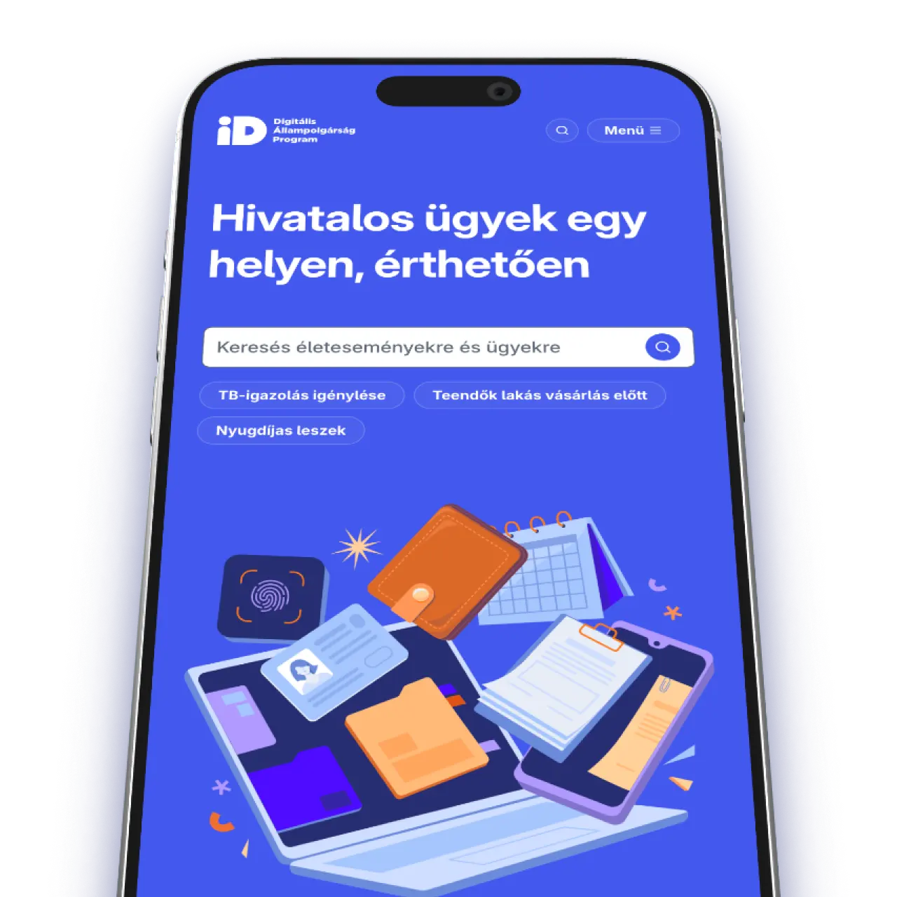
The DÁP digital citizenship portal on a phone, with a search field for life events and quick links such as requesting a social security certificate.

Design discovery for

Burger King: a clearer POS for faster order taking

Identified key pain points in the in-store POS system through interviews and on-site observation. By addressing key challenges in order processing and service, we created a more flexible interface that saves time and minimizes disruptions.

A guest in a denim jacket holding a Whopper in front of a Burger King branded backdrop.
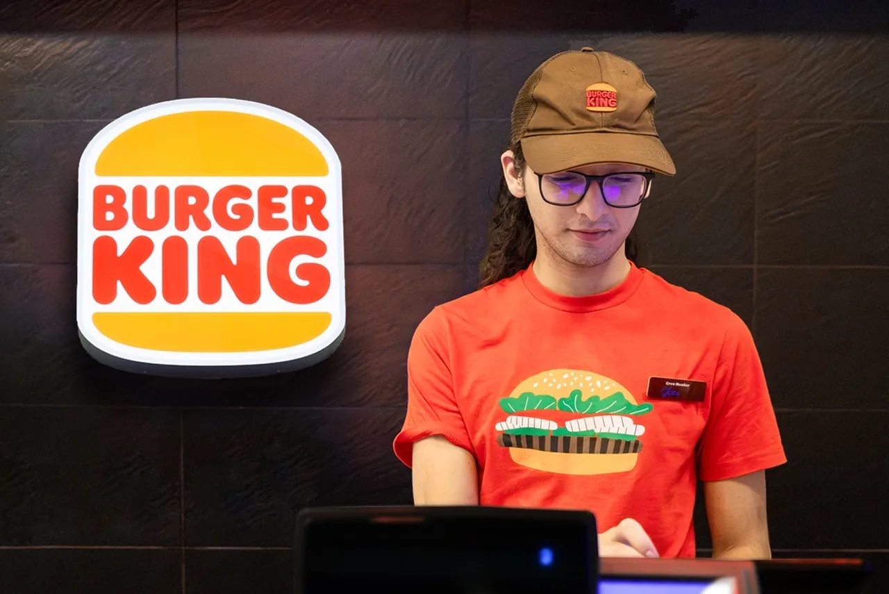
I interviewed stakeholders and staff in different roles, and with my colleagues ran field research in several Budapest restaurants at peak and quiet times.
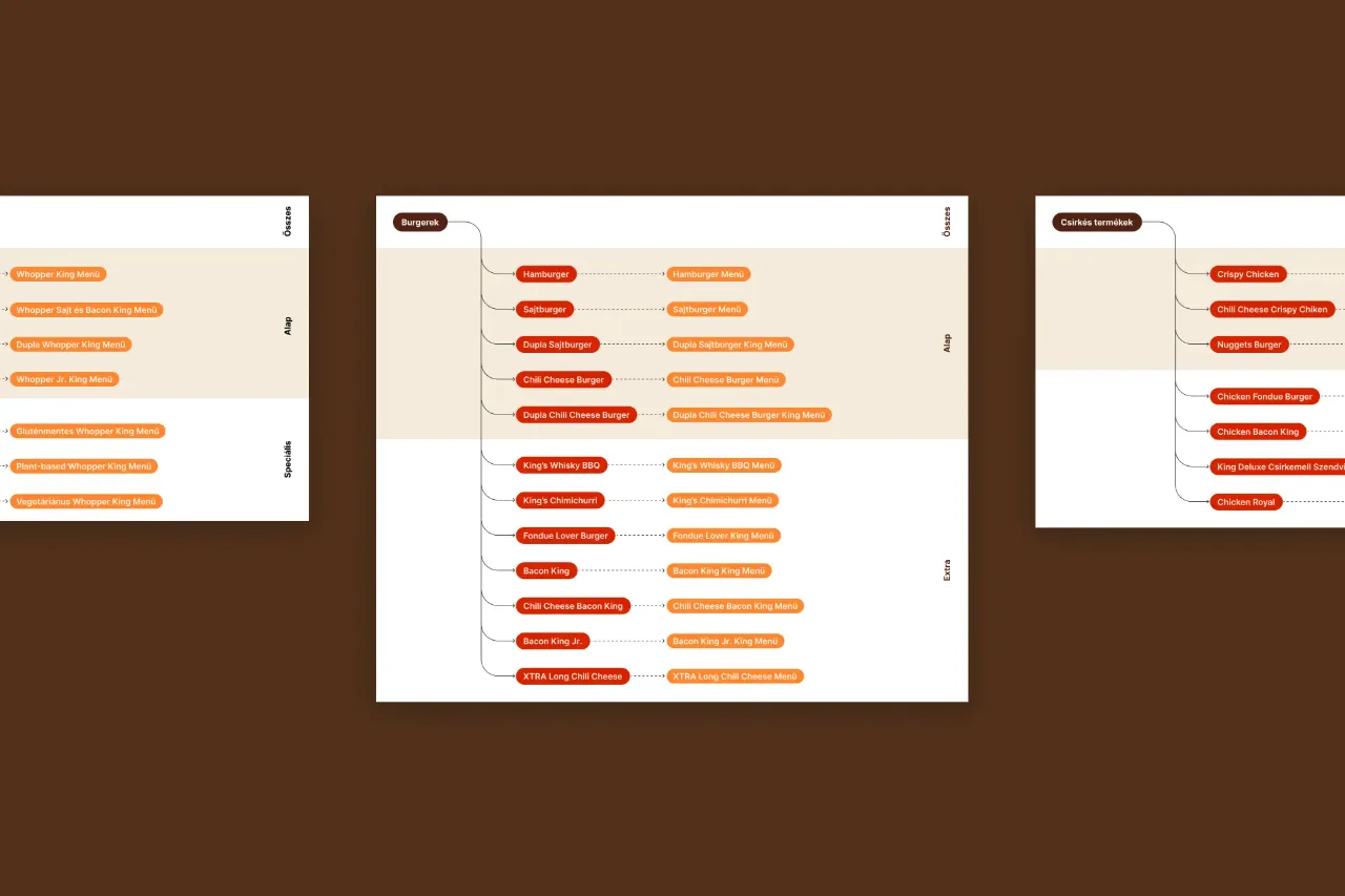
Product category maps: burger and chicken product trees, each item linked to its menu version.
I mapped every product category and its ordering options.
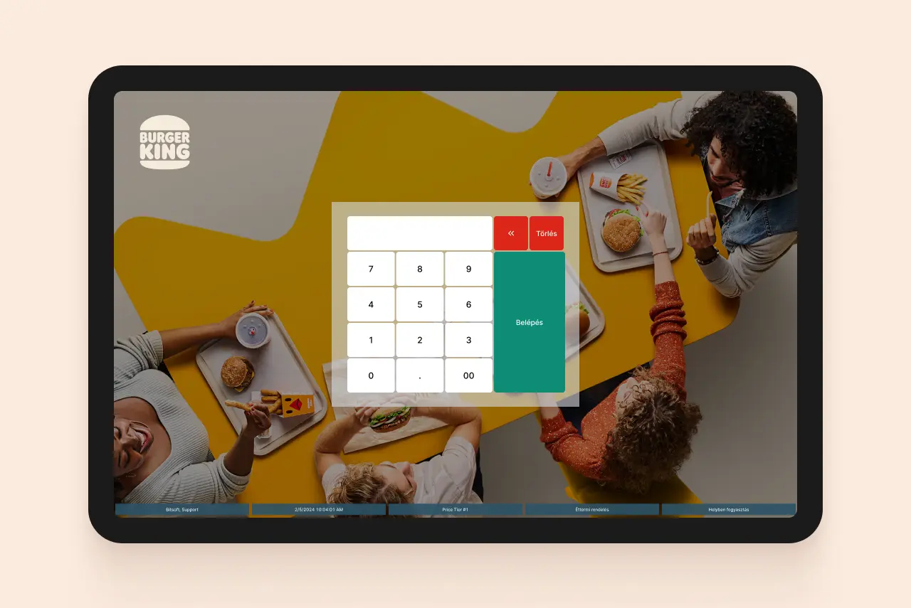
A Burger King POS tablet showing the numeric staff login keypad over a brand photograph of guests eating.
Together with the team, we created a consistent rule for shortening product names, which is now in use.

UX design for

Euronics: rethinking a fragmented checkout as one clear, mobile-friendly flow

Improved the checkout experience through UX research and benchmarking, introducing clearer flows, a shipping cost calculator, and personalized offers.

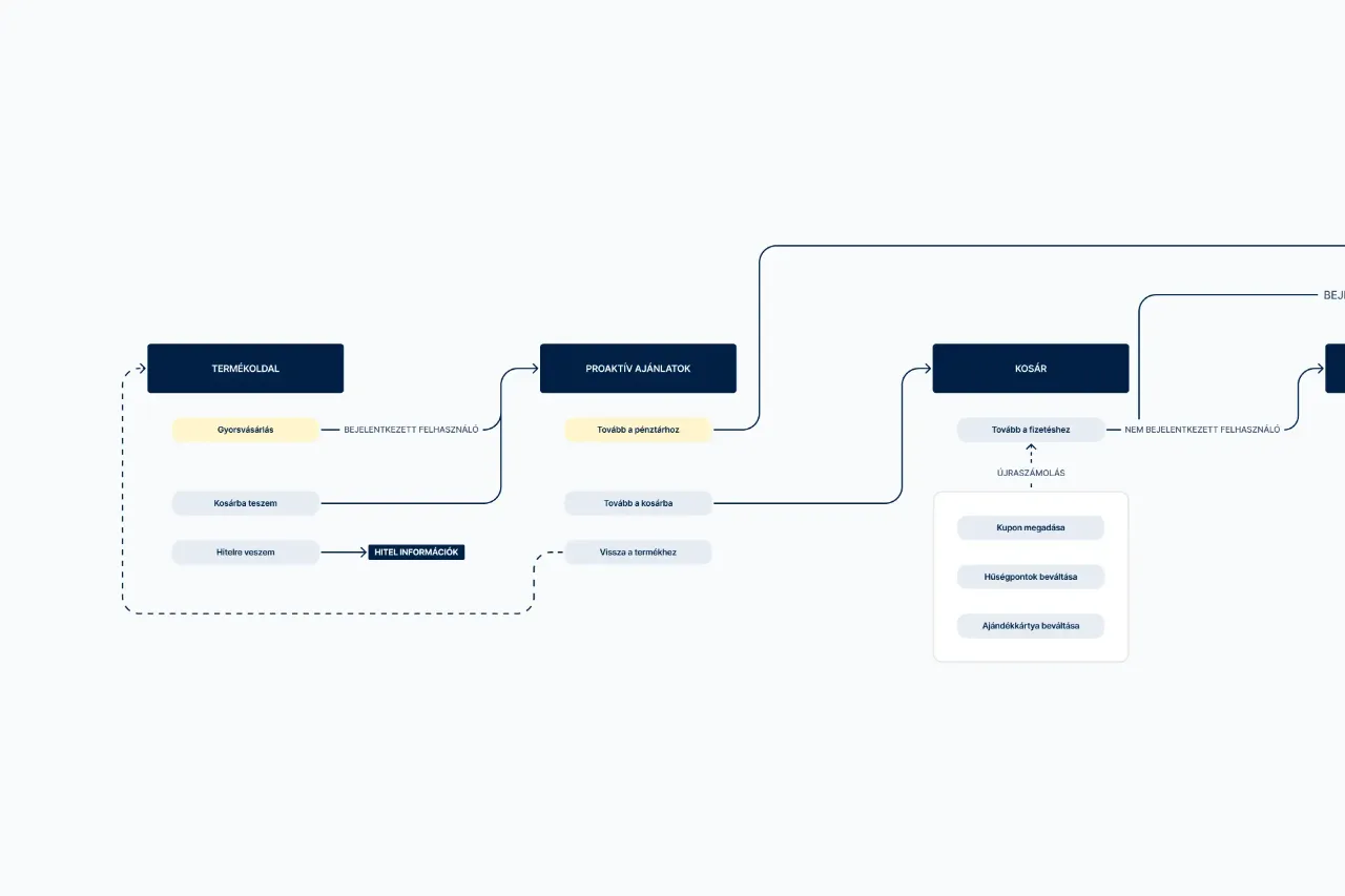
Checkout user flow diagram connecting the product page, proactive offers and the cart, with separate paths for logged-in and guest users.
I started with a UX audit and a competitor benchmark, then defined the key problem areas with the stakeholders.
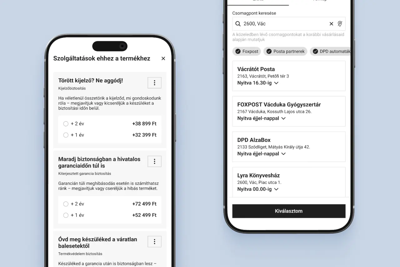
Two mobile checkout screens: warranty and device protection options, and pickup point selection by postcode.
I proposed solutions in three areas: clearer, better-prioritized add-on services (financing, product insurance, extended warranty), a mobile layout with touch-friendly controls and less clutter, and one coherent checkout flow instead of steps added over time.

Design discovery for

The Hungarian State Treasury: improving the accessibility and user experience of government bond apps

Worked with the UI team to redesign the Hungarian State Treasury’s online sales interfaces, turning user research findings into more accessible user experiences.

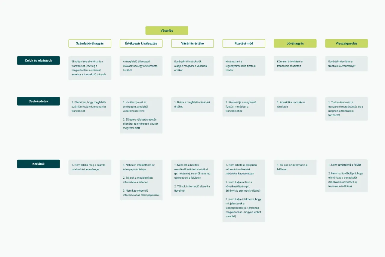
User journey map of the purchase process, with rows for goals, actions and constraints across six steps.
I interviewed Treasury stakeholders and, together with my colleagues, conducted user interviews and think-aloud usability sessions with people of different ages. I turned the findings into journey maps of key flows, which the design team used to guide the redesign.
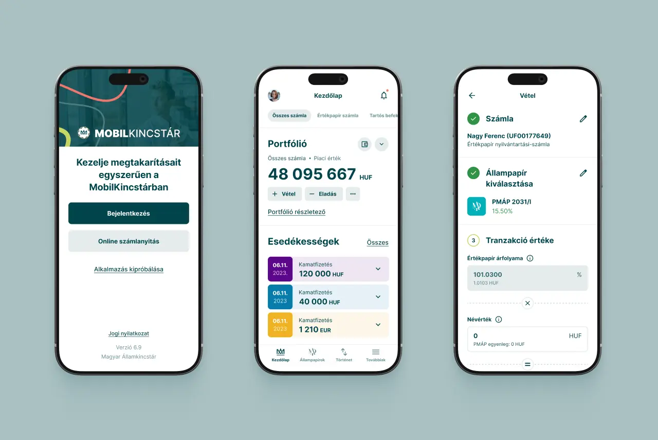
Three MobilKincstár app screens: sign-in, portfolio overview, and a government bond purchase flow.
We made the buy and sell steps clearly distinguishable, added instant feedback on input errors, and followed WCAG AA from the start.

Write-up on

Why digital accessibility matters: equal access, Europe’s aging population and the economic impact

Have you ever wanted to use a digital service but couldn’t? Maybe you’d sprained your wrist and the website only worked well with a mouse. Or maybe you were on the subway, realized you’d left your headphones at home, and wanted to watch a video - but there were no captions.

In moments like these, we usually just get a little annoyed and find another way to do what we needed. We might briefly wish the website worked with more than just a mouse, or that the video had captions. Most of us only think about the benefits of accessible design when something temporarily stops us from using a service the usual way. But for many users, these barriers aren’t temporary at all - they’re permanent.

Digital accessibility matters because it gives everyone an equal chance to reach the information and services available online, regardless of their physical, sensory, or cognitive abilities.
Design discovery for

Layher: a B2B webshop for mobile scaffolding, with expert advice built in

Designing a new digital experience for premium scaffolding products. Discovery showed two main problems: selling higher-priced mobile scaffolding in a price-sensitive market without losing personal advice, and showing delivery costs upfront for large, heavy products.

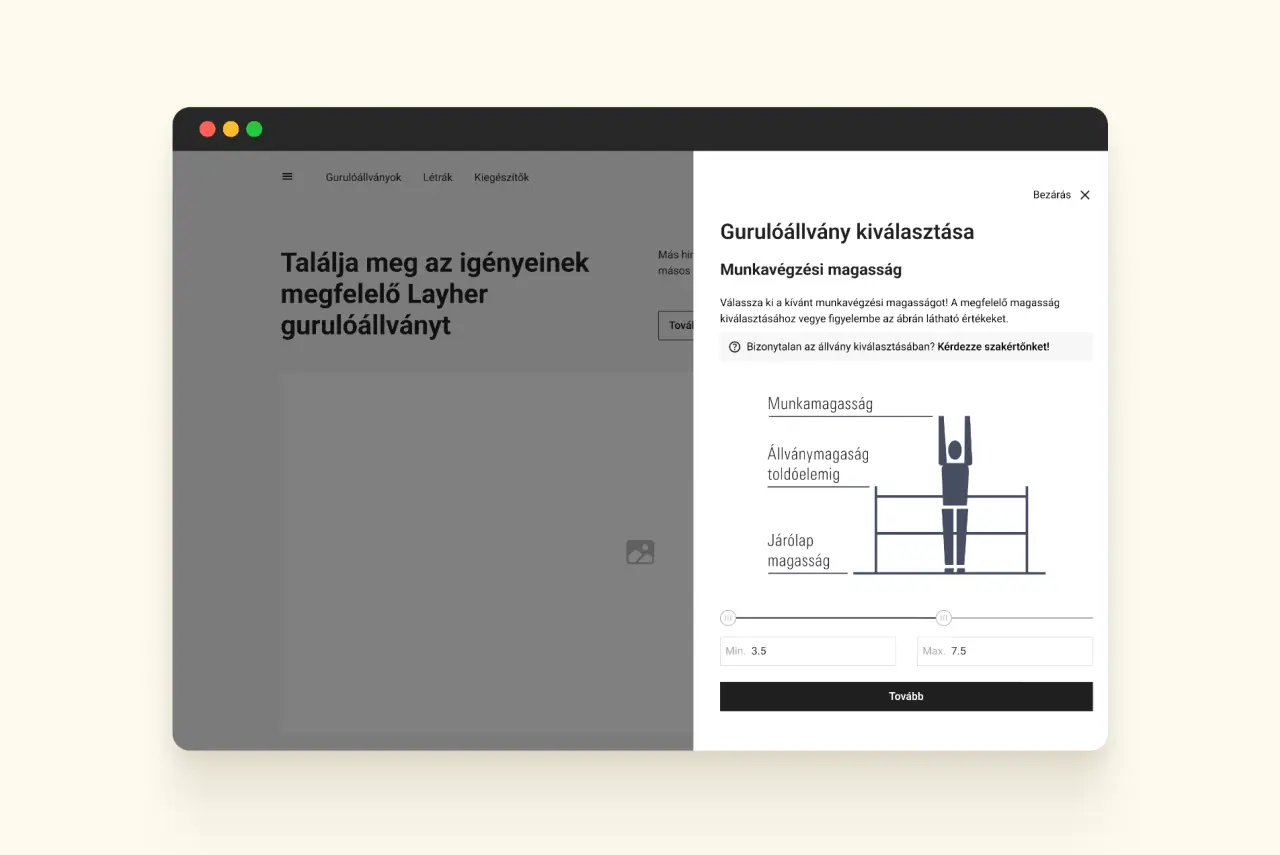
Scaffolding selector dialog with a working height diagram, a range slider and a prompt to ask an expert.
Building on Layher’s expertise and strong customer relationships, the webshop puts personal assistance at the heart of the experience, balancing direct communication with online purchasing.
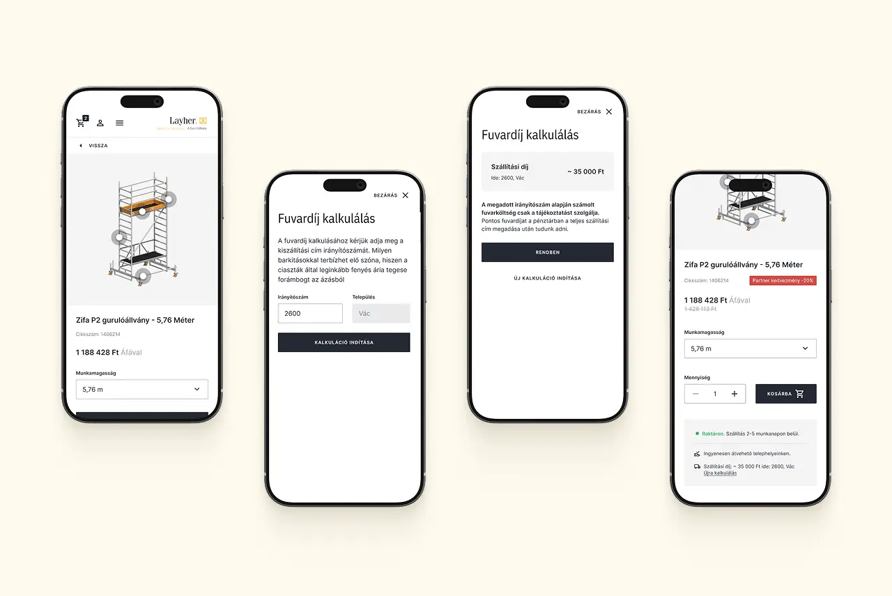
Webshop screens showing the delivery fee calculator: postcode entry and the estimated shipping cost on a product page.
We introduced a shipping cost calculator that provides an upfront estimate of the delivery fee based on the product’s size and weight and the delivery postal code.

Redesign of

The Origo news portal: a homepage system built around how editors work and what readers need

Redesigned Origo’s homepage structure and collaborated with the team to create a more visually balanced and consistent UI.

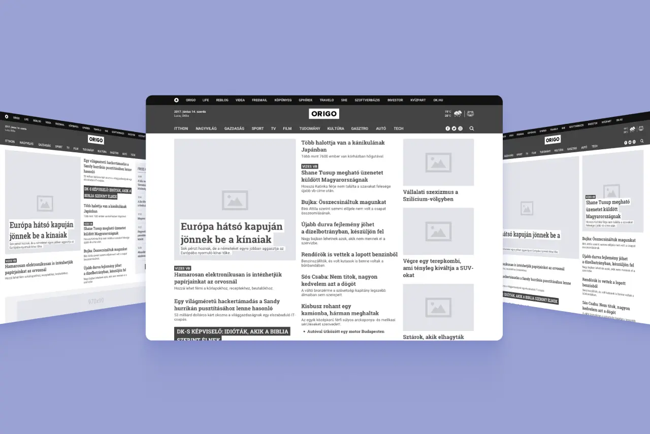
Three Origo homepage layout variants, each structuring the lead story differently.
I designed several first-screen layouts for different news situations, with a stepped visual hierarchy for stories of different importance, all within responsive layout rules.
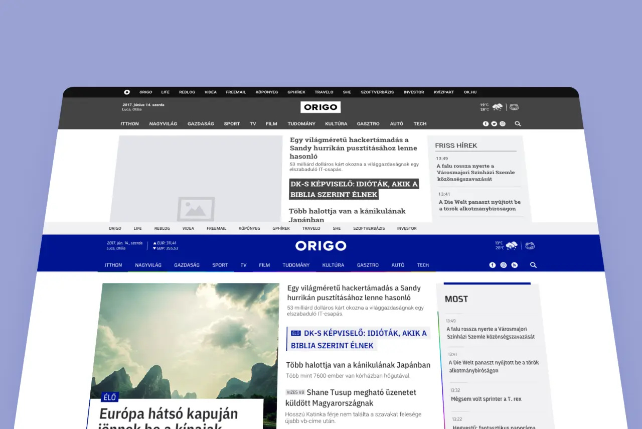
Two versions of the Origo news homepage side by side: a grey layout study and the finished colour design.
Together with the lead designer, we created a clear logic for the homepage highlights while keeping the page visually balanced.