Research
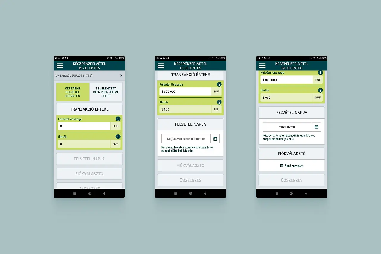
I used several UX research methods to understand the client’s and the users’ needs precisely. First, I interviewed senior decision-makers at the Treasury to understand the business goals and the challenges around the system. Then, to uncover the current pain points, my colleagues and I recruited users from different age groups, interviewed them, and asked them to think aloud while using a few preselected key flows. I synthesized the research findings into journey maps of the key flows, which helped the design team identify improvement opportunities and shape the redesigned features.
Challenges
One of the biggest challenges was designing an interface that meets the needs of different generations. We needed to keep the platform’s existing strengths while moving it toward a simpler, more interactive and more modern experience, closer to what people know from neobank apps, especially on mobile. At the same time, the modernization had to work for the existing, mostly older customer base. The quality of the mobile app was especially important, because the Treasury is not the only seller of government bonds online: banks, insurers and brokerages sell them too.
Solutions
Together with the design team, we found that the most important features of the online channels are transaction management (buying and selling) and portfolio management, so we optimized these flows first. The main task was to make every feature on the screen clear, and to give users precise, instant feedback on input errors.
I recommended that we focus on the transaction flow in particular: similar-looking screens followed one another and a lot of information was repeated, which made it hard for users to tell the steps apart and to make confident decisions.
Results
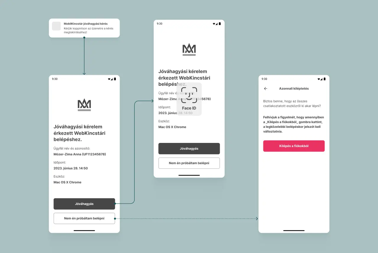
Based on the research findings, the design team and I redesigned the key flows for transactions and portfolio management. We made buying and selling steps easier to distinguish and added immediate feedback for input errors. Accessibility was a key consideration throughout the design process, with WCAG 2.1 AA guidelines informing our decisions from the start. My colleagues developed the documented design system for WebKincstár and MobilKincstár, with research insights from my work supporting their efforts.
Takeaways
I took away two main lessons from this project:
- On a financial interface, confidence matters most. Similar screens following one another in the transaction flows didn’t just slow users down, they also made them unsure about their decisions. Many users are already used to the convenience of their bank’s (or neobank’s) app, so it’s worth building on those familiar patterns.
- Looking ahead, testing with assistive technology users could reveal further accessibility improvements, while baseline metrics would help quantify the impact of the redesign.